"Clouds" |

|

|
Title: "Clouds" (Bottle and Advertisement) Medium: Digital (Procreate) + Sticker Paper Completion: August 3rd, 2022 |
Exhibition Text
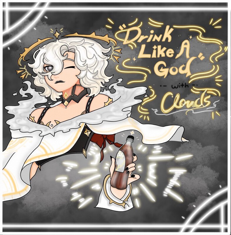
Through "Clouds" we explore the world and how the people through it craft a product out of the grace of the gods. Using inspiration from advertisements through the past and Alphonse Mucha's creative take on posters, Clouds gives a heavenly taste to a flavor that was in the past, impossible to taste, the taste of the clouds themselves.
Artist Inspiration:
|
I was inspired by Alphonse Mucha's work using Art Nouveau throughout his work and the glorious decorative woman and theme each of his pieces have. His work as a Czech painter, illustrator and graphic artists, heavily inspires the type of take I wanted to include throughout the piece. The examples shown on this website page encapsule what I would take as an "advertisement" like piece made by Mucha, which works well while I'm trying to incorporate a piece that is developed within itself as a product. Something I love about Mucha's work is that it's not that easy to see a male figure throughout most of his work, he actually uses the female form most often in all of his pieces. I can say I do something similar as I believe it is easier to express a variety of choices within the female form and outfits given to them, I want to create such similar powerful but royal looking woman with my advertisement, as I am not working on a simple character, but a god. |

|

|
Another thing I absolutely adore about Alphonse Mucha's work is the amount of detail put into each piece. For example, the piece to my left demonstrates just some much detail you can look around and find throughout the piece, it is not something you can just simply take a quick glance at. I do something similar with my sketching process in which I create exemplars that become almost difficult to finalize the way it was sketched because my amount of detail put in by pencil. Another thing about this piece of work is the stylized version that goes within the fashion and design of something that looks like the olden times. You can just tell from the work itself that is represents something from the past, and it is an actual advertisement for some-sort of champagne, which was what I wanted to go for at first but bringing a bottle of champagne to a school area just screams how to get into a predicament that I didn't want to deal with, so I went for a similar classy but different approach. It is a perfect depiction of a royal but classy way of advertising a bottle and/or product. |
|
Now this isn't a piece of work by Alphonse Mucha, but it is important to show this inspiration because my work follows the Americanized style of advertisement for following drink posters throughout the time of production. The most I want out of this piece of work advertising the Coca-Cola bottle is the placement and attitude of the woman holding the bottle, what about this wants to MAKE someone get this drink? Well, the woman looks very happy about what she is drinking, and her happiness is also played out by the way she is prepped up into a beautiful royal outfit that gets cut off, not fully out shadowing the drink, but still takes place within the advertise of the bottle. I want to take into account the inspirational words that declare you to have a coke, now that speaks volumes, plus it is simple to remember in the mind. The feeling of a catchphrase made to tell others to "drink this like everyone else," and transforming it into "drinking like a god." |

|
Planning

|
My first page of planning was dedicated to the god of clouds, the one and only that created this gift for humans to celebrate with others, but is it truly the god herself, or a human-tainted version of her for advertising? I had three different types of designs for this, the strict but humble, the kind and elegant, or the sassy but gifted. The bottom right design I felt fit more for kids, but it didn't exactly go with my inspiration for the old type of advertisements I wanted. The middle design was honestly me doing way too much for an original design, something that looked completely godlike, but I felt the need to tone down for this project, and not give myself too much to get carried away with. The finalized design follows a classy but wavy hair design rivaling those from the past, it is much richer which I liked the most, so it is the same as the top left design for the finalized piece. |
|
This part for the planning had more words because I wanted to figure out the actual advertising style I wanted with the piece. How would I create the logo or poster, the thought of "Clouds" hit me because it was too the point but put into a fancy cursive that made it look rich. Another part was if I wanted kids or how I wanted the goddess to be placed within the advertisement, there was a more planned out sketch at the top that compares heavily to Mucha's style of works, but it was a bit too much for a simple bottle advertisement, especially how those are carried out here compared to other places. This also gave a better description to what even is the drink, and it was exactly just a heavenly taste. The perception of the drink is to hold it carefully, when opened it's almost as if clouds will fly out of the bottle, so make sure to cover your drink quickly, but otherwise, no harm in clouds placed in the sky. The drink is a perfect exemplar for parties or celebrations as it drinks exactly as if you've reached the top, perhaps why it's gotten so industrialized by those in more power. |

|

|
Now, this page brings more into part two of the design, the actual bottle and product. My first want was something that modeled after the champagne bottle, but restrictions made me pick out something simpler. The logo would be placed in front of the bottle per usual, and its nutrition facts would go among the back of the bottle. Another thing placed on the back of the bottle would be something no one could replicate, a signature of the goddess herself within a representing mini logo of her design, which is what those went off of for the design of the advertisement. The bottle has a striking cap that is possible to unscrew off, but the fun is popping off the cap and viewing exploding flavors within your own eyes, the experience is said to be one of a kind. (When in reality it was made for anyone to use) The nutrition facts would include its own ingredients, which is basically the structure of actual clouds combined with a regular soda. The bottle is represented as one of the most wishful drinks in the world and acclaimed by most celebrities. |
Process:

|
Firstly, was the poster/advertisement for the drink "Clouds." To the left, we start off with my sketch that I moved onto the app on my tablet, Procreate, an application that allows the use of a variety of brushes and tools. Moving from that, I start off lining off the work before I begin the coloring, and outline of everything in black is useful for when I remove the sketch and move on to the coloring of the piece. Seen off to the right I always start off with the face and body, I usually don't want to do the hair first, but initially I wanted to get the whole top part finished. I tried coloring in a realistic way using different gradients of the skin color and adding many outlines to show the way the hair curls sort of like how Mucha doesn't have black outlines along the hair.
|

|

|
Next, I had moved on to the actual logo and signature saying of the advertisement, "Drink like a god." The saying is outlined in a royal gold that has lined outlines showing importance to the saying. This follows the coke advertisement with a simple statement featuring the name of the drink within the drinks signature colors. Another thing I included was showing more importance to the drink itself with the light pen that added a glowing effect to the lines around the bottle. This isn't an inspirational reference but fitted more towards the actual theme of the drink. Though started on the left, on the right it shows how I crafted the outfit of the goddess with a classic white outside and a darker inside, almost following the way the drink appears with the white tag and darker inside.
|

|

|
After doing a bit of shading around the areas that would obviously get darker thanks to overlapping clothes or etc., I moved on to the background. Th background is as simple as the coke advertisement as it follows a singular color to the back but twisting it up, I added a variety of clouds along the back of the goddess and saying, this is self-explanatory as why clouds would be in the back, it's an obvious connection. On the right, the finished product, I added a couple of glowing outlining white lines because I thought it fit well and it added a really nice vibe to the theme of godly light on the poster. The character was finished and next was to move on to the bottle design. |

|

|
With the bottle logo I started off by measuring what size would fit against the selected bottle's tag. After that, the photo to the right includes my first design in full, I crafted out my own nutrition facts and wanted an image of the clouds emerging out of the bottle as it should within the actual product. It also includes a signature from the goddess herself, but who could real an actual goddess's language, still clouds surround the logo.
|

|

|
After some words from my family, I decided to include the person within the bottle design, except what went wrong with that design was that the shape of the bottle stretched out the image, which transitioned to the final piece. (Image on the right) It placed the goddess above the logo, clouds surrounding herself as she holds the drink above the logo as well. Next was to attach design to an actual bottle.
|

|

|
As said before, lastly was to print out the logo, attach it to the bottle and done and one. This actually took quite a while unfortunately. As shown on the photo to the left, you can see how the failed second logo would wrap around the certain bottle, but the photo to the right shows the finalized logo was placed onto the bottle. When I said it took a while, I had to print out each separate design. cut it out with the white outline, then see if it works on the bottle and it took various hours to attach it on. I used sticker paper to easily attach the logo onto the bottle and done and done! |

|
Experimentation:

|
These include the old concept designs of the god of clouds, Nephele mostly because this counts as my experimentation for the variety of forms she could have taken throughout the process of concept. Each different concept revolves around a separate idea I had some part relating to my inspiration and my own ideas of what a god of clouds would look like. We see the one chosen, but these all had a variety of designs that would've reflected among the poster creation and placement on the bottle tag. Each goddess also has their own personality and separate factors relating to the theme of who would want to buy the drink after seeing this character.
|

|

|
Another thing I experimented with was the placement of the bottles for the photography part of the project. It was very sunny outside and some part of the sun ruined many of the photos causing a couple errors. The photo to the left was pretty blurry at first anyways but still it wasn't used because I wasn't really a fan of the location. Though the photo on the right is in the same location it included a print of both the front and back of the bottle, this wasn't an error, I thought honestly it looked kind of fancy, but I wasn't a complete fan of it, so the photo used is more in depth with a classy background. |

|
Critique:
|

|

|

|
Similarities:
- My Advertisement and Coca-Cola's Follow a Similar Format: We both include a person placed at the top as the drink goes below them, within that we also have a phrase somewhere on the poster.
- The Female Figure: All of our pieces use a female representor as a person for importance within the certain advertisement. Each woman is also dressed in something accustomed to the certain thing being expressed.
- The Use of Outlining: Mucha and my work use the significance of outlines around certain objects and words through our pieces. Mucha has outlines throughout the outside of the woman and the outline of each object, while my outlines also go on the outside of the female figure.
- Reality vs. Digital: My work uses a program that works out digitally with specialized tools for the use of coloring and line-art, while Mucha and Coca-Cola either use realistic figures or work with other mediums such as painting.
- Stylized-Pieces: My work obviously doesn't follow some similar rules to Mucha and the realistic ways of Coca-Cola's real woman. My character has bigger eyes, but also things that make them inhuman follow the structure of a goddess, her floating crown for example.
Reflection:
This project was definitely one of the biggest I had ever actually worked on. Considering all the different things i had to manage and take care of, coming up with an advertisement and an entire drink fully was something I never thought I would actually do. I actually wanted to do this ever since I saw how MIAD had their own students do something like this, although theirs is probably planned way better than mine. Still, with all that I was able to do, I am very happy with the final product of this project, it actually feels like something I created and really liked. My inspirations we're filled with things I like, as in Mucha's style and how I like to drink Coco-Cola, and I had a lot of fun doing the project. Fully talking about the project, it wasn't the most difficult to do, I just wish I fully was accustomed to the Digital work style, because I could put out something really amazing, but it all takes growth. Even within saying that, I am proud of myself for doing all that was put into this project, the concept, ideas, and layout all worked out and I love the outcome. Skills I would still adjust would probably be to connect the same art style as Mucha and like I said before, become better at digital art styles so I make something that looks something as realistic as the Coca-Cola advertisement.
Since this is my last project of the summer before next school year begins, I want to talk about growth. I went from a rough start to a pretty overcoming ending within my junior year of art. I grew a more accustomed style and worked with artists I felt more encapsuled my ideas. Many of my past projects felt pretty uncooked, but these actually feel like my ideas on a canvas, even if it isn't on a canvas itself. My own skills have improved as well, I am able to finish projects a lot quicker than when I started, and my ideas feel more in suit with my own ideals and feelings. Within this project alone, I worked within a bigger idea and even created a product of my own, almost like the one assignment from both MIAD and UWM, but something that actually feels more real than those. I think it connects with my own want to be a designer, in most of my works I include a variety of character experimentation and I believe I have ever growned how it looked at the start, especially from my first painting to my most recent project.
Since this is my last project of the summer before next school year begins, I want to talk about growth. I went from a rough start to a pretty overcoming ending within my junior year of art. I grew a more accustomed style and worked with artists I felt more encapsuled my ideas. Many of my past projects felt pretty uncooked, but these actually feel like my ideas on a canvas, even if it isn't on a canvas itself. My own skills have improved as well, I am able to finish projects a lot quicker than when I started, and my ideas feel more in suit with my own ideals and feelings. Within this project alone, I worked within a bigger idea and even created a product of my own, almost like the one assignment from both MIAD and UWM, but something that actually feels more real than those. I think it connects with my own want to be a designer, in most of my works I include a variety of character experimentation and I believe I have ever growned how it looked at the start, especially from my first painting to my most recent project.
: Connecting to the ACT :
- Clearly explain and describe how you are able to identify the cause-effect relationships between your inspiration and its effect upon your artwork?
Within two of my inspirations, it simple revolves around the cause of Mucha's relevance around female figures and the central style Coca-Cola advertisements had around American culture that inspired the poster for my piece, the logo revolves around basic bottle covers as well.
2. What is the overall approach (point of view) the author (from your research) has regarding the topic of your inspiration?
Mucha had done a variety of advertisements around some parts of his works, and the world of drink advertisements follow a similar format along the way they advertise towards the people they want to buy their own product.
3. What kind of generalizations and conclusions have you discovered about people, ideas, cultures, etc. while you researched your inspiration?
The creative crafting around different advertisings aligns with the type of people creating them. While a company can get out a simpler design, and artist like Mucha can give out an artistic masterpiece advertising something as simple as a drink.
4. What was the central idea or theme around your inspirational research?
My central theme revolved around how the world of advertising looked across from other places in the world, I already knew Mucha by a previous project and wanted to work along incorporating his work in a way that accustoms my style and style of other drink advertisings.
5. What kind of inferences ( conclusions reached on the basis of evidence and reasoning ) did you make while reading your research?
I realized that art can be subjective to anything, if you take into consideration how simple the Coca-Cola ad looks, you forget how much work actually was put into the advertisement with photography, software editing, and more.
Citations in MLA Format
“Alphonse Maria Mucha.” Alphonse Maria Mucha - The Complete Works, https://www.alfonsmucha.org/.
Foundation, Mucha. Mucha Foundation, http://www.muchafoundation.org/en.
“Alphonse Mucha: Art Nouveau Visionary.” North Carolina Museum of Art, 19 Jan. 2022, https://ncartmuseum.org/series/alphonse-mucha-art-nouveau-visionary/.
Foundation, Mucha. Mucha Foundation, http://www.muchafoundation.org/en.
“Alphonse Mucha: Art Nouveau Visionary.” North Carolina Museum of Art, 19 Jan. 2022, https://ncartmuseum.org/series/alphonse-mucha-art-nouveau-visionary/.
